New Brews
New skins up in the sidebar...
[UPDATE: Check out Firecracker Weird!]
First is Firecracker. I started this one as a tribute/rip-off of Wizbang. I wanted to put the big firecracker explosion over on the right hand side at the top of the links. It looked pretty crappy so I used the image as a background for the date and sidetitle divs. Then I used a 1px outline to make it pop off the black background a little better. I re-worked my banner image to stretch all the way across the page up to 1290px wide. I aligned the image right top, no-repeat and it looks great. It would look better, I think, with a text banner instead of my banner images, but they still look ok for a skin.
Next is Purple Fog. I found this really cool image for trees and fog shot through a purple filter. It's a pretty large image so I aligned it right bottom and fixed. Then, I grabbed a color off the background, ran it through my disgronifier and got 10 shades to work with. I used a combination of the color scheme to make the date and sidetitle divs look like raised buttons. I used white backgrounds and opacity settings of .60 for the blogbody and side divs so you could see the page background image through the posts and links. The date and sidetitle divs I set as full opacity so it gives a better visual clue to the page divisions. The only thing about opacity settings I don't like, is that I haven't figured out how to make the embedded images 100%... yet.
I designed these skins for full screen viewing at 1280x1024. Both designs degrade gracefully down to 800x600. I haven't checked then in IE yet as IE sucks and is not CSS standards compliant. They both look great in Mozilla 1.6 though.
Last Call »
I've got another design over at the MadLab for MuNuviana that has a white background. I popped that baby into a black background and... It.Is.Tough!!!
If they don't like it at MuNu, I'll bring it over here as a skin along with the white one.
« You're cut off!
Bullshit so far »
»
by
Madfish Willie on May 25
::
Permalink
::
Comments (0)
::
HammerHead
Tech Support - Pullquotes
From Susie, from SilverBlue, from KiwiFruit, from Mandarin Design
Pullquotes...
I've seen several sites over the last few days using a neat little CSS formatting trick to display pullquotes like a magazine. Here is a screen cap of my at MadLab test site
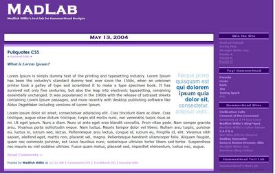
I set mine up in my stylesheet. See the extended entry for the code I used. I have included the code for a left float pullquote and a right float pullquote.
Last Call »
Here is my CSS for the pullquotes plus the colored and formatted text.
.pullquoteRt {
float:right;
width:175px;
padding-bottom:10px;
margin-top:10px;
margin-bottom:10px;
margin-left:10px;
font-family:Arial, Helvetica, Georgia;
font-size: 26px;
line-height:28px;
color:#B1D3EC;
text-align: right;
}
.pullquoteLt {
float:left;
width:175px;
padding-bottom:10px;
margin-top:10px;
margin-bottom:10px;
margin-right:10px;
font-family:Arial, Helvetica, Georgia;
font-size: 26px;
line-height:28px;
color:#B1D3EC;
text-align: left;
}
.dark {
color: #285577;
font-weight: bolder;
}
.med {
color: #0066B2;
font-weight: bold;
}
.reg {
color: #6CAAD9;
font-weight: normal;
}
.light {
color: #B1D3EC;
font-weight: lighter;
}
Here is the text in my post edit box:
<span class="dark"><i>What is Lorem Ipsum?</i></span>
<span class="pullquoteRt">Neque porro
<span class="reg">quisquam est </span>
<span class="med">qui dolorem </span>
<span class="dark">ipsum quia </span>
<span class="med">dolor sit, </span>
<span class="reg">consectetur, </span>
<span class="light">adipisci velit...</span></span>
Lorem Ipsum is simply dummy text of the printing and typesetting industry. Lorem Ipsum has been the industry's standard dummy text ever since the 1500s, when an unknown printer took a galley of type and scrambled it to make a type specimen book. It has survived not only five centuries, but also the leap into electronic typesetting, remaining essentially unchanged. It was popularised in the 1960s with the release of Letraset sheets containing Lorem Ipsum passages, and more recently with desktop publishing software like Aldus PageMaker including versions of Lorem Ipsum.
Lorem ipsum dolor sit amet, consectetuer adipiscing elit. Cras tincidunt diam ac diam. Cras tristique, augue vitae dictum tristique, turpis elit mollis nunc, nec venenatis turpis risus ac mi. Ut eget ipsum. Nunc a diam. Nunc ut ante eget eros blandit convallis. Proin vitae pede. Nam semper gravida arcu. Vivamus porta sollicitudin neque. Nam luctus. Mauris tempor dolor vel libero. Nullam arcu turpis, pulvinar eu, luctus in, rutrum sed, lectus. Pellentesque arcu lectus, congue id, rutrum eu, fringilla id, elit. Vivamus nibh sapien, eleifend eget, mattis non, placerat vel, magna. Pellentesque hendrerit ullamcorper felis. Aliquam feugiat, quam nec commodo pulvinar, est lacus faucibus nunc, scelerisque ultricies tortor libero sed tortor. Suspendisse nec mauris eu nisl sodales ultrices. Fusce quam metus, placerat sed, imperdiet elementum, luctus nec, augue.
Here is a preview of the post:

You won't see any colored text, at least in Mozilla, and it won't "look" like it will display in the browser.
You can put the code anywhere you want in your stylesheet.
You have to assign the span class everytime you want to use the code. If you take a real close look at what you did in your post today and compare it to what I did in my post, you'll see that mine is the easier way to duplicate... much less actual code to remember and type in. If you only want to assign one color or class to the entire pullquote, then the whole process is shortened. I just tried to re-create what everyone was posting for their test samples.
You can also modify and/or use the color codes in any other part of your post. You only have to surround the desired text in the span tags and assign the span tag a class code. I have several that I use occasionally at MFW so I don't have to type in all the font tags individually.
Sample from Madfish Willie CSS:
.mrn {
color:#800000;
font-weight:bold;
}
.blu {
color:#0000FF;
font-weight:bold;
}
.blue {
color:#000067;
font-weight:bold;
}
.ind {
color:#4B0082;
font-weight:bold;
}
Then, when I want to use maroon text, I just do this:
<span class="mrn">Selected text for color</span>
Which will display: Selected text for color
I've counted the keystrokes and the CSS code is shorter that using the font tags, plus you don't have to memorize a bunch of color codes, just the class name.
And, if you ever want to change the code for a different look or color, you will have a blog-wide change, which is the point of CSS in the first place.
Note: I've just added a top and bottom border on the sample over at MadLab. I think think they help set the pullquotes off a bit better.
« You're cut off!
Bullshit so far »
»
by
Madfish Willie on May 15
::
Permalink
::
Comments (0)
::
HammerHead
Imperial Animatrix
The Imperial Animatrix has struck again!
Check out the cool new graphics she did for Madfish Willie's.
Hit the [F5] button or refresh your screen to cycle throught the new banner images she did for Madfish Willie's.
This on I'm going to use for my comments and trackbacks.

She does awesome work, don't you think?
Below are a couple of images she is doing for our re-design of Kevin Aylward's Wizbang Tech site. Kevin won the bidding/donation for a site re-design during the recent bloggers Spirit of America fund raising drive.
Last Call »
Bullshit so far »
Aaawwww.... You're so sweet!! :)
If talent were boobs, she'd be the entire city of Ft. Lauderdale during Spring Break :-)
« Shut your pie-hole!
»
by
Madfish Willie on May 8
::
Permalink
::
Comments (5)
::
Deferred
::
HammerHead
Bad Example
Well, just finished up the design for fellow MuNuvian Harvey's new blog over Bad Example.
We finally got him off the world's slowest loading blooger list. I used to pull his page up, go grab some coffee, make some breakfast, take a crap, read the paper and then finally his site would be up. And I have a broadband connection.
It's a complete design overhaul. He's got a nice 3 column design with all kinds of thingys & doodads to make the reader experience a little easier. For those visually or harware impaired, we set up a link to a 800x600 view for the main page. If you need to view 800x600 click the littel button and you'll go to a 2 column design with the same content and the two sidebars merges together.
Pam did all the banners (12 to be exact) and we have several of them in a rotating banner script. She really does a great job coming up with new and unique ideas for all the sites she works with.
He's even started to post so I need to give him his first official MuNu trackback.
Go over and tell him to Fuck Off... tell 'em Madfish sent you!
Bullshit so far »
Consider my off fucked.
Thanks, Barkeep :-)
Glad to see you support BWB, MW. I like the site designs. Care to fill me in? Mine needs work.
achat noms de domaine, hebergement internet, hebergement php, hebergement site, hebergement sites internet
« Shut your pie-hole!
»
by
Madfish Willie on May 7
::
Permalink
::
Comments (4)
::
HammerHead
Designing Ideas!
Color codes... what are they... where do I find them... how do I use them... what about fonts...
Thse are some questions we ask when starting on a design for our site. I have compiled some links to answer these questions and presented them by groups in the extended entry.
Design gurus will tell you that content is king and design presentation should not detract from the actual content of your post. I am not presenting this information to discuss the theories of content and presentation. I am presenting it as a set of tools for you to use and decide for yourself how you want to present your content to your corner of the the world.
I tend to favor a more bold approach to using color in my designs, whereas other designers prefer a more subtle approach. I've tried to give you enough information and reference sources so you would be able to make your own decisions and present your content how you want it to look for your readers. After all... it's your site... do what
YOU want to do.
Last Call »
Color codes...
W3Schools: CSS Colors
What are they...
There are 3 ways to specify color codes in your HTML and CSS stylesheets:
| Unit |
Description |
| color_name |
A color name (red) |
| rgb(x,x,x) |
A rgb value (rgb(255,0,0)) |
| rgb(y%, y%, y%) |
A rgb percentage value (rgb(100%,0%,0%)) |
| #rrggbb |
A hex number (#ff0000). |
Where do I find them...
Visibone Webmaster's Color Lab
Visibone Webmaster's Color Card
Madarin Design: Web Color Swatches
ColorMatch 5K
Web Color Reference: Named Colors
Web Color Reference: Proprietary Color Names
How do I use them....
Dmitry's Design Lab: The World of Color
Communicate With Color
Color Matters - Design Art: Color Theory
What about fonts...
Visibone Webdesigner's Font Card
A really neat color code converter...
Southern Twilight RGB to Hex and Hex to RBG Converter
Feedback from
MuNuviana
Rob from
Xset:
Just my 2c worth. Hex codes can be shortened to a 3 digit number (yeah I know it's got letters in it - it's still a number) so #ff0000 can become #f00, black becomes #000 and white becomes #fff.
Annika from
Annika's Poetry & Journal:
One great way to get hexadecimal color codes I discovered is through Photoshop. On the lower right corner of the color selector chart is a little box that shows the color code for whatever color you have selected, which takes a lot of the guesswork out of it.
Madfish Willie:
I appreciate your input. Will three digit hex codes validate as proper CSS? It seems I've read somewhere that the validators require six digits??? With six digit hex codes, you get a broader range of colors.
Rob from
Xset:
They should validate as they are valid hex equivalents to their 6 digit cousins. And I meant it only as a short hand method of entering appropriate colors. By all means use 6 digit codes for more complex hues.
Ted from
Rocket Jones:
I do the same thing as Annika, but with Paint Shop Pro. When doing a banner, I select a color to match, then read the color code given in hex. Works like a champ, and makes it easy to clone that particularly nice blue you found on someone else's site.
Bravo Romeo Delta from
Anticipatory Retaliation:
A neat color-picker can be found here (http://www.pixy.cz/apps/barvy/index-en.html). Cool stuff soon as I figure out how to do something wid it.
« You're cut off!
Bullshit so far »
»
by
Madfish Willie on April 13
::
Permalink
::
Comments (0)
::
HammerHead
»
Ramblings of SilverBlue links with:
Massive Link-Luv™
Madfish Willie's Cyber Saloon
Well, now I've went and done it....
I've noticed my blog has been loading really slooooooow, here since lately. So after I finished Eric's new design today, I did some more housekeeping over here.
I determined several things were making my site load slow. Here's what I did:
Last Call »
I had external calls for scripts to load both the Munuviana blogroll and my personal stuff from Blogrolling.com. Those two things were always hanging up the load times. So, for Munuviana, I just hard coded in the members in; for Blogrolling.com, I put in a D'oh! listing. I'll access those sites from my toolbar and gradually work them into the hard coded categories where they fit in.
I had a rotating banner script that selected a random banner from six choices. While the banner images are fairly large (as most banner images are), I decided I could rotate them out myself each week when I vote for the New Blog Showcase. I put my vote at the bottom of my sidebar, because it just has to be on the fron page to be counted.
Which brings us to the number of posts displayed on the page. I have my configuration set to 7 days. Well, some days I post 4 or 5 times. That's a lot of posts over a week's time. So, I decided to only show the last 20 posts. Then, in the sidebar above the Archives grouping, I put in a group that will show the titles of the last 15 posts that went off the page, so there would be easier access to them. [In case you can't live without the Dumb-Ass Jokes!]
I also took out most of my internal calls to stuff in modules and hard coded them into the index file. I left in the comments thingy, the extended text roll down thingy, and the random toasts thingys just because I wanted to. So there....
The net result is that my page should load quicker and you can get on with your business quicker when you visit. Let me know if there is anything you would like to see changed back!
« You're cut off!
Bullshit so far »
Heya! Regarding the referrer script that I use over at justagirlintheworld.com . . .
I use the script offered over at http://www.blogtricks.com
Hope that helps you!
« Shut your pie-hole!
»
by
Madfish Willie on January 5
::
Permalink
::
Comments (2)
::
HammerHead
HammerHead Blog Design
HammerHead Blog Designs is proud to announce the birth of a new baby boy!
Eric, the Straight White Guy now has a brand new custom designed look! Go over and check it out and buy Eric a cigar... or a grilling Apron!
Pamibe over at Drowning at 2 Feet Sea Level did all the banners and graphics and buttons for the site [more than once, I might add]. I just can't describe how well she responds to what the site owner wants and comes out with something unique for each individual project. Just a marvelous talent as far as I'm concerned.
Madfish Willie had to pull out the big hammer and do some serious beating about Eric's head and shoulders for extended periods of time. Just kidding... actually it was probably the other way around, although we did run into some unique design challenges to make the site operational for his readers viewing exclusively with 800x600 resolution.
Eric decided it was time for a change and decided he wanted a three column design. So we did the three layout and put it up on his main site. Needless to say, there was much knashing of teeth and raising of hell! So, we decided to take the site down, put up his old site and direct everyone over the HammerHead design studio at MadLab. Eric did a post directing his readers to come by the site and leave comments on what they were seeing with what browser at what resolution. We left it up there for a couple of days and worked out each problem as it came up.
Last Call »
We finally worked out the main design challenge - which was making the site viewable in 800x600 resolution. A three column design is just not conducive for 800x600 viewing. My inspiration and guidelines for overcoming this issue came from Jim at Snooze Button Dreams. I have a test skin up over there that he points to and accesses via a different index file and associated stylesheet. So, I tore that page out of his book added a script from JaveScript.com and adapted it for Eric's site. As you go to Eric's main page, you will notice a button labled [View Old Format] in the left sidebar. When you click that button, it takes you to his old two column layout. We formatted the site using the new stylesheet and adapted the three column index to the two column layout. We were both real pleased at the poutcome and the flexibility it gives him in presenting his site.
One of the features of this method is that when he posts to his main site, both sites are updated when the index is rebuilt! Cool beans! I also used some modular techniques in order to update the links in both indexes with just one edit.
We did most of the debugging and troubleshooting via MS Messenger so I could respond immediately to his change request. At each edit we would either approve the change and move fporward or go back and start over. It was a very effective way get things done for both of us.
Here is a list of some of the other features we designed for Eric:
- Custom 3 column design
- Custom 2 column design
- Custom banners & logos
- Custom graphics in sidebars
- Custom archive pages logos
- Custom comment pages logos
- Custom trackback page logo
- Custom sidebar background images
- Custom body background image
- Custom blog background image
- Custom archive page designs
- Custom comment page designs
- Custom trackback page design
- Custom display trackback pings code
- Expanding & collapsing extended entry scripts
- Expanding & collapsing comments viewer scripts
- Text formatting buttons in comment listing and comment preview templates
- Coding based on heavy use of modular programming techniques
- Access to a secondary site updating with primary site data for 800x600 viewers
« You're cut off!
Bullshit so far »
I was over there - it really looks terrific. Everyone did a wonderful job!
yep..you are the column-killing KING...and Pam is the Queen of Cocktail Graphics! THANKS!!
« Shut your pie-hole!
»
by
Madfish Willie on January 4
::
Permalink
::
Comments (2)
::
HammerHead
»
Just A Girl In The World links with:
Today's Blurfing
HammerHead Blog Designs
HammerHead Blog Designs has just completed a new custom, 3-column, blog design for Linda at Civilization Calls. I did a complete custom job including the main page, comment listing template, comment preview template, trackback template, individual entry archives, category archives and monthly archives. I also added some scripts for better functionality. Go by and take a look when you have some time.
HammerHead Blog Designs also just did a little stylesheet tweak over at Susie's Practical Penumbra because we love her so much.
The next project is for Eric at Straight White Guy. It is in the HammerHead testing facility, better known as the MadLab! It's in the beta testing stage right now. Go over there and wonder through the site... it's not very long, only four or five test posts. Leave comments on what you find in the way of bugs and formatting errors. Don't forget to tell me what your browser is and what resolution your are viewing in.
After that project is complete, HammerHead Blog Designs will be working on putting skins on the site over at MuNuviana for our group blog. that should prove to be an interesting project, for me anyway.
When you have time, go check out the other designs HammerHead Blog Designs has completed. They are all listed and linked in the sidebar. Let me know what you find that needs corrected. Sometimes by the end of the project I get kind of weirded out and miss stuff that I should have caught. That's why I'm leaving Eric's site up at MadLab for a couple of days... to find the little stuff while I still have access to all the files.
Bullshit so far »
Thank you, dear Barkeep! I loved being tweaked....
Damn susie... let me get the post up before you start commenting! I bet you got here just as it went up... that's freaky....
Civilization Calls is lovely, but I'm credited with doing the graphics [lower left on the page]... but I didn't!
Have to cry foul on that one! :^D
D'oh! I used cut and paste from a module to insert that and forgot to take that part out. I'll go right over and take care of it.
I went over to civilization calls, and the two sidebars are overlapping the middle column. Its completely unreadable. I'm using internet explorer 6.0.
What resolution are you at? 1024x768 / 800x600 ?
It's fine in IE6.0, 1024, full screen, fine in Mozilla1.5, 1024, full screen
« Shut your pie-hole!
»
by
Madfish Willie on January 3
::
Permalink
::
Comments (7)
::
HammerHead
Friday Happy Hour
Moe's Toast...
"Here's to the model husband,
Usually somebody elses."
Bart's Call to Moe
[Bart]
Bea O'Problem! Bea O'Problem! Come on, guys, do I have a Bea O'Problem here?
Barney says "You sure do!"
Oh...it's you, isn't it?
Listen, you. When I get a hold of you, I'm going to use your head for a bucket and paint my house with your brains!
Bart laughs
Today's Drinking Story
Caller 6 - You're On The Air
Yogism: "We made too many wrong mistakes."
Things A Man Should Know: About Women:Love does not mean never having to say you're sorry. It means having to say you're sorry over and over again, in new and different ways, every day, every week, every month, even when you don't want to, every year, until God grants you his mercy and you finally, blissfully die.
ClueBat Insults: Thou craven, toad-spotted maggot-pie!
Movie Madness
Toad Turmoil
Dumb-Ass FarmYard Animal Jokes
What do you call a pig thief ?
What do you get if you cross pigs with a lot of grapes ?
What do you get if you cross a cow with a camel ?
What is the definition of a goose ?
What is the opposite of cock-a doodle-doo ?
What's the best way to keep milk from turning sour ?
Why was the lamb told off for being rude ?
What goes 'peck,bang,peck,bang,peck,bang' ?
What do you get if you cross a pile of mud with a pig ?
How do you take a pig to hospital ?
Today's Foreign Language Party Cookie is Tagalog / Phillipines (click thru for the really good stuff) Wala kang puwet: you are buttless
gago: stupid
tanga: dumbass
inutil: worthless moron
chupa: blowjob
Cheers!
Bullshit so far »
»
by
Madfish Willie on October 17
::
Permalink
::
Comments (0)
::
HammerHead











Pretty damn cool.
shelli bullshitted on May 08, 2004 at 01:03 PM