
Here are some really cool new banners Pam did for Madfish Willie's. These are all in my rotatong banner script. Each time you go to my page, a random image script will select display a different banner! It keeps the site lookijg fresh without a lot of work... I'm pretty lazy.
[NOTE: I have reduced the image sizes so they would fit in the body of this window at 800x600 view. So the images may look a bit jagged or whoppy-jawed. Go to my site and press [F5] to cycle through the different banners]
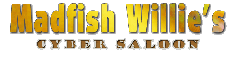
This first one has a background of beer in a glass layers on top of it for that golden look.
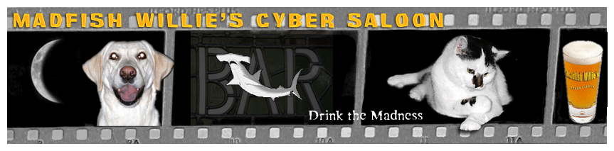
This one is a whimsical look at my animals.
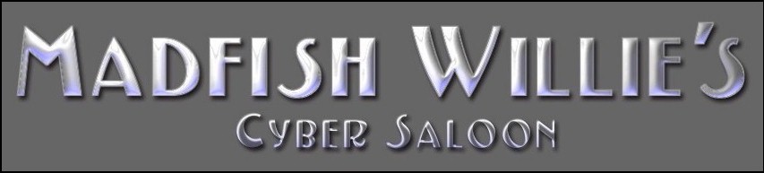
This has a really neat metal effect. On a dark background, it gave some contrast to the monchromatic color scheme in place at the time.
Same metal effect with a background that matched an older color scheme. It really tied the site together.
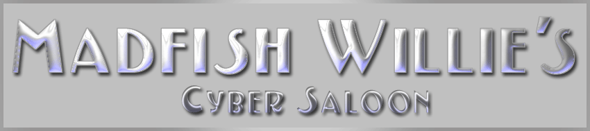
This is the metal effect again, but with a transparent background. I used a lot of colored textured backgrounds and this type of graphic looks like it is floating over the background.

Here are my two favorite banner images in the rotating banner script.
Here are the images for the comments and trackback windows respectively.
More page banner images in the extended entry.
More Argghhh!!! - Banners » Read Comments »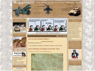
Above is a screen capture of the final design presented and approved by Castle Argghhh!!.
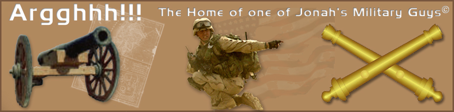
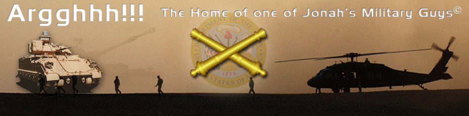
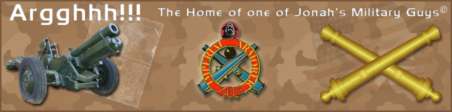
This is a site we did for Pam's buddy Sir John of Argghhh!!!. She is, after all, the Imperial Animatrix. We also did his wife, Beth's, site at She Who Will Be Obeyed!.
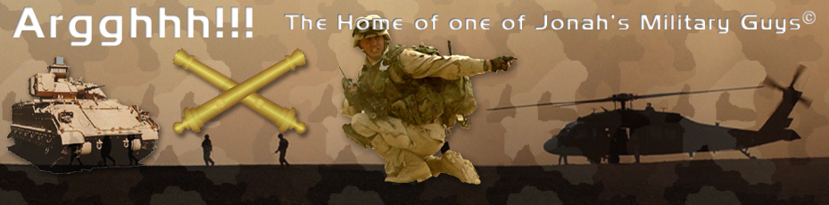
Sir John is ex-military and wanted a militaru schem. We decided we wanted to do something with a desert camoflage background and pick some complimentary colors for the rest of the design. Finding a pattern that tiled on the page properly was THE major boggle in completing this design.
The graphics on this site are just awesome. Pam did several different page banners with cannons and machine guns and stuff like. Then she did some small banners for the comments and trackback windows. I just can't say how talented I think she is. She always comes up with awesome stuff. I'll put all her Argghhh!! in another post so you can see them all.
Site Features:
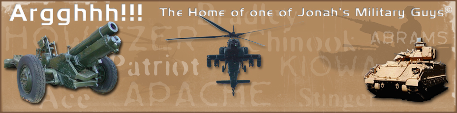
More Argghhh!!! - Final Design » Read Comments »These are two of the best page banners.


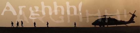
These are the banners for the comments and trackbacks windows respectively.


More cool banners in the extended entry!
More Bad Example - Banners » Read Comments »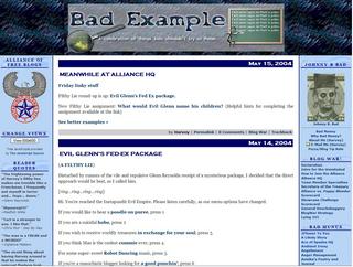
Above is a screen capture of the final design presented and approved by Bad Example.
This is a site I did for my buddy Harvey. It's all his fault I got into this blogging thingy... his, and Matty O'Blackfive.
His old site at Bad Money was a slow loading dog. I used to open a second IE window just for his site and browse around in the other window till his got loaded. His site had been acting funky for several weeks so, after several months of not so gentle poking and prodding, we finally convinced him to move over to MuNuviana and an MT blogging system.
The graphics on this site are just awesome. Pam took the mental image Harvey gave her, improved on them and turned out some really fantastic logos and backgrounds. Page load speed was an essential element of his design and we took that into account in optimizing the size of his banner images. Outstanding work! I'll put all her Bad Example banners in another post so you can see them all.
Site Features:
More Bad Example - Final Design » Read Comments »
Above is a screen capture of the final design presented and approved by Homicidal Maniak.
Here is a full screen sample at 1024x768 resolution. This view is the site non IE users will see. The embedded font technology will not show in other browsers. The following view for the 800x600 resolution show the embedded font in the date bar, in the post title, and the sidebar titles.
Here is a full screen sample espceially for viewers 800x600 resolution. This view is implemented via a button at the top of the left column. Clicking the button will give the readers with 800x600 resolution access to a readable site. Both sites update simultaneously through the regular posting method. I also installed modules for the links that will update both site views with one edit. Cool stuff!
Here is an Trackback Template screen sample. I installed the logo graphic and tweaked the CSS for this template. I also installed the logo graphic on all the comment templates.
Here is a roll-down or expanding comment listing screen sample. The shows how the previous comments display when you click the roll-down comment link. I really like this script because I don't like waiting for the comment window to open. A reader friendly feature.
Here is a closed comments in the Monthly or Date-Based Archives screen sample. To prevent the old comments from being spammed, I installed a script that closes access to comment posting after 30 days. Notice that on the January 29 post the comment link is working. The January 30 post has the comments disabled and tells the reader that there are "x" comments to read via the roll-down comment feature.
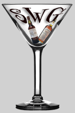
This site was more of a "complete and tweak" design effort. The site author had the basic layout, color scheme, and graphics completed, but was trying to implement a 3 column design. A regular reader of Eric over at Straight White Guy, she passed a message to me via Eric. So, we got together and implemented a 3 column design plus did some slight tweaking to the stylesheet.
This site required a couple of new design elements that were fun to implement.
Site Features:
More Homicidal Maniak - Final Design » Read Comments »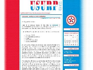
Above is a screen capture of the final design presented and approved by U S U R P [United Society of Unusually Responsible People].
Here is a full screen sample at 1024x768 resolution. It's a large image, so it may take a while to download on a dial-up connection.
Here is a full screen sample at 800x600 resolution. On the 800x600 view, the red is solid all the way to the edge of the page, and the blue fades to white toward the edge of the page.
Here is an Individual Entry Archives screen sample. I placed all the archives in the same format as the main page for a consistant look and access to all the site links from any view.
Here is a comment listing screen sample. I placed the trasparent gif logo on all the comment and trackback templates so the colored background would show through.
Notice that the design is off-center with the red column on the left narrower than the blue column on the right. We matched the color scheme to an existing logo the site administrator had already designed. Then, we tweaked his logo design to make it a transparent gif image to place on the blue background of the comments and trackback listings. The background is a 20px high image with three color columns. We repeated the image down the Y-axis of the body to achieve the gradient fill effect with the colors fading to white. This approach required us to use exact positioning methods to place the content column and the sidebar column.
All in all, this site required several unusual and challenging design aspects that were fun to implement.
Site Features:
More U S U R P - Final Design » Read Comments »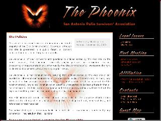
Above is a screen capture of the final design presented and approved by San Antonio Polio Survivors Association.
Here is a full screen sample at 1024x768 resolution.
Here is a 800x600 resolution screen sample.
This is a site I did for my mother. She is an retired RN and a polio survivor. She does a monthly newlewsletter for her local support group, and I thought it would be a good idea for her to put all this stuff on-line.
The graphics on this site are just awesome. Pam took the image my mom liked and turned out some really fantastic logos and backgrounds. Then, she used that same type-style to use as captions for the sidetitles. Phenomenal work!
Site Features:
More S A P S A - Final Design » Read Comments »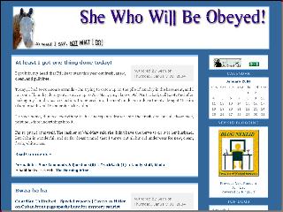
Above is a screen capture of the final design presented and approved by Beth at She Who Will Be Obeyed. Here is a 800x600 full screen sample.
Site Features:
More She Who Will Be Obeyed - Final Design » Read Comments »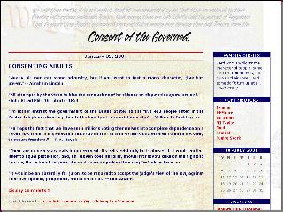
Above is a screen capture of the final design presented and approved by Consent of the Governed site administators. Here is a 800x600 full screen sample.
Site Features:
More Consent of the Governed - Final Design » Read Comments »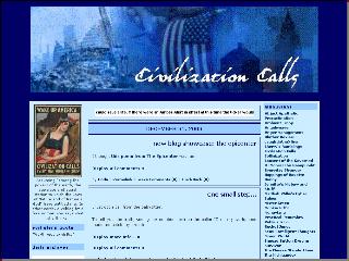
Above is a screen capture of the final design presented and approved by Civilization Calls. Here is a 800x600 full screen sample.
Site Features:
More Civilization Calls - Final Design » Read Comments »HammerHead Blog Designs is proud to announce the birth of a new baby boy!
Eric, the Straight White Guy now has a brand new custom designed look! Go over and check it out and buy Eric a cigar... or a grilling Apron!
Pamibe over at Drowning at 2 Feet Sea Level did all the banners and graphics and buttons for the site [more than once, I might add]. I just can't describe how well she responds to what the site owner wants and comes out with something unique for each individual project. Just a marvelous talent as far as I'm concerned.
Madfish Willie had to pull out the big hammer and do some serious beating about Eric's head and shoulders for extended periods of time. Just kidding... actually it was probably the other way around, although we did run into some unique design challenges to make the site operational for his readers viewing exclusively with 800x600 resolution.
Eric decided it was time for a change and decided he wanted a three column design. So we did the three layout and put it up on his main site. Needless to say, there was much gnashing of teeth and raising of hell! So, we decided to take the site down, put up his old site and direct everyone over the HammerHead design studio at MadLab. Eric did a post directing his readers to come by the site and leave comments on what they were seeing with what browser at what resolution. We left it up there for a couple of days and worked out each problem as it came up.
We finally worked out the main design challenge - which was making the site viewable in 800x600 resolution. A three column design is just not conducive for 800x600 viewing. My inspiration and guidelines for overcoming this issue came from Jim at Snooze Button Dreams. I have a test skin up over there that he points to and accesses via a different index file and associated stylesheet. So, I tore that page out of his book added a script from JaveScript.com and adapted it for Eric's site. As you go to Eric's main page, you will notice a button labeled [View Old Format] in the left sidebar. When you click that button, it takes you to his old two column layout. We formatted the site using the new stylesheet and adapted the three column index to the two column layout. We were both real pleased at the outcome and the flexibility it gives him in presenting his site.
One of the features of this method is that when he posts to his main site, both sites are updated when the index is rebuilt! Cool beans! I also used some modular techniques in order to update the links in both indexes with just one edit.
We did most of the debugging and troubleshooting via MS Messenger so I could respond immediately to his change requests. At each edit we would either approve the change and move forward or go back and start over. It was a very effective way get things done for both of us.
Here is a list of some of the other features we designed for Eric:
Ms Pam: I was thinking that I need to maybe limit the number of small graphics per site in the middle sidebar. Maybe I could get a 150px wide pamibe dog and anything else you have available. I'll probably switch out the SAPSA images for maybe one plus the phoenix logo thingy. What I'm trying to do is keep the center column at least as long as the far right column to keep a "balanced" look. If you have any other images you'd like to highlight and display here let me know where to grab them.
Also, you will notice several posts pointing to the HTML pages of logos you have done for some of the sites we have worked on together. Could you edit the SAPSA page so that the sidetitles are not there and the text is off? Thanks a whole lot.! If you could upload those pages to HammerHead, it will take the bandwidth back to where it should be. Just let me know when and what the path is and I'll edit the posts.
Any design credit logos will point back to HammerHead so that bandwidth will come off this site also.
I'll start working on the backpages for this site on Saturday. Tomorrow I need to finished Linda's site Civilization Calls. I'll be on-line after noonish, so holler if you need anything.
Read Comments »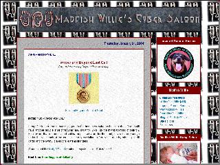
Above is a screen capture of the last design for Madfish Willie's Cyber Saloon. I kept messing around and tweaking this site from the get go, so this is about the 8th or 9th design I have displayed on this site. This particualr background is for New Year's Eve. I change the background wallpaper out all the time to keep the site fresh for both of my regular readers. How about that baby picture?
Here is a 800x600 full screen sample. It may take some time to load... be patient!
Site Features:
| S | M | T | W | T | F | S |
|---|---|---|---|---|---|---|
| 1 | 2 | 3 | ||||
| 4 | 5 | 6 | 7 | 8 | 9 | 10 |
| 11 | 12 | 13 | 14 | 15 | 16 | 17 |
| 18 | 19 | 20 | 21 | 22 | 23 | 24 |
| 25 | 26 | 27 | 28 | 29 | 30 |


Get all the fools on your side and you can be elected to anything. Frank Dane
Biomedics 55 toric commented on November 28, 2004 at 09:12 AM