Straight White Guy Design
I've done all I am going to do on this site for today.
After dinner, I'll start on the design for Eric at Straight White Guy. I'll do the layouts and margins and stuff like that first, then we can work on the colors and insert the graphics. If you can give me some color codes then we will be set to go on that end.
I guess I need to get with Eric and find out what doodads and widgets and thingys he wants me to install. I'll send him over to the MadLab to watch the progress and comment as he sees something happening. So I guess that I'll be over there the rest of the night other than when I do my regular posting.
Read comments »
Pam, on the main menu page in MT you can change your username and password if you want to (I know I misspelled it) by going throught the Edit Profile menu. Let me know if you need help.
posted by
The Bartender at December 30, 2003 11:52 PM
« Hide comments
by
Madfish Willie
on
Dec 29, 2003
::
Permalink
::
Comments(1)
::
Design Thoughts
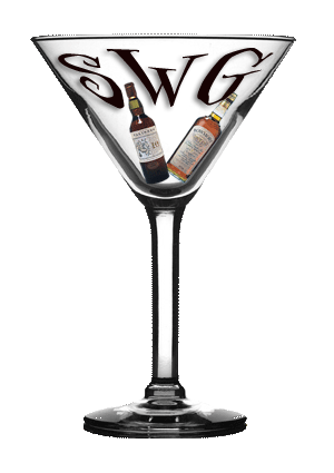
Prelim logo design for SWG

These are the bottles Eric was referring to in the email I forwarded.
Haven't worked in the jam session, mountains or usmc yet... Eric will be peeking out from the rim... ;)
I was thinking... If this -or the finished version - were set in the style sheet as the background image, then it wouldn't be the header... Maybe it could be static... Just thinking...
Read comments »
Yeah. We could make that a static image that doesn't scroll. Maybe set the background on the body to transparent and you can see the logo all the time. Would have to use a font color that shows good on both light and dark! Nice work!
posted by
The Bartender at December 29, 2003 05:08 PM
Let's put all those other pics in one of the sidebars. I'll be putting all the miscellaneous stuff like archives and calendars and logos [oh, my!] on the left side and all the links on the right side - like Civilization Calls. I think with this nice graphic we shouldn't clutter it up.
posted by
The Bartender at December 29, 2003 05:21 PM
Hey guys, I love the graphic...you guys are great! Is that going to be the actual size of the graphic when it is placed on the site, or is it going to be smaller?
posted by
eric at December 30, 2003 08:54 AM
Actually, I just showed this to a friend, and they like the fact that the shark is circling the bowl of the martini glass...any chance of keeping that in there?
posted by
Eric at December 30, 2003 04:00 PM
« Hide comments
HammerHead Post BG
I've been corresponding with Eric about his graphics, so we've got that moving forward. :)
What about a banner for HammerHead? Or do you want to stay with text?
Read comments »
That's the Ticket! HammerHead Shark in the post eating everything up!
We need a banner, but I want to get the columns lined up first so we can tell what size and where to place it. I'll go work on that right now and impletment some of the column changes I talked about earlier.
I'm thinking about Eric's design myself and what colors to use. I'm going to grab a USMC logo off the Marine site and maybe use it somewhere in the design... shrink it and put it beside each post title or something like that... maybe place it on the posted by line...
I'll start on that later today.
posted by
The Bartender at December 29, 2003 01:55 PM
That's funny; I was just going to ask what colors you wanted - or he wanted - to use for his design...
I snagged a great high res anchor globe & eagle if you'd like it.... :)
posted by
pam at December 29, 2003 03:39 PM
« Hide comments
Blog Design
Here's what I'm thinking for design on this site:
3 column layout...
Column [large] for posting on the far left...
Column [small] for graphics in the middle...
Column [small] for site listings and links on the far right...
We could display sample buttons/logos/etc in the graphics column... maybe do the same logos on a light background and a dark background... save the top positions in the graphics column for new project displays.
I'll have to do just some HTML pages for services, displaying screen shot of different sites, tables of graphics, banners/logos/buttons, etc
We'll have to install a script so people can't grab the images for sure. I'll start looking for that tomorrow. I think Serenity has one that disables right-clicking on her pages.
I put up the PayPal thingy at the top of the existing column, but it will move when the design process starts.
I put up a short design listing and testimonials same as Madfish Willie's... should the sidetitles be serious or have a sense of humor? I vote for funny myself, but I'm weird. Do you have a listing or anything of the different stuff you've done? We can upload all the images to this site and display them here for sampling etc.
I'm freaking out!!!!1 Waaaaaaah!!!!!
More designing thoughts »
Just kidding! I'm in no real big hurry to get this page done right now. Still thinking about it and what I want to accomplish. I really need to finish Linda and get Eric's underway before I mess around with this too much. Maybe I'll just do a post to keep on top till we can get rolling. Post date it or we just change the date on it when we post something new that would push it down.
« No more thinking!
Read comments »
I want a large image of a hammerhead shark to put in the center of each post like I did over at SAPSA. Damn, these are getting to be shark infested waters! Watch out...
posted by
The Bartender at December 29, 2003 01:36 AM
Even if you install a "no right click" script it's so easy to lift a graphic. All you have to do is run your cursor over an image in IE and it gives you the option of saving the picture, script or no.
What graphics would you be protecting? [confizzled]
posted by
pam at December 29, 2003 12:23 PM
« Hide comments
by
Madfish Willie
on
Dec 29, 2003
::
Permalink
::
Comments(2)
::
Design Thoughts
More...
I tried many, many things with that one champagne glass background, and just couldn't make it work. So, I made both cotbb & cotbg logos similar .... Both are 128px wide and 105px high. If they aren't okay, let me know...
I like the water background. :)


Read comments »
You are the best! I like the Corner logos much better than the ones I did... mine look like poop... but I have to say it was my very first attempt at doing any image work.
The HammerHead will look great on sites with really dark backgrounds. I put the transparent one on over at SAPSA and the edges look a little rough. This one will look much better, especially with the maroon border.
Is the water background going to work with a banner style logo? I bet it will look great as a page background!! I can't wait to get started on this site's design... I have lots o' cool ideas!!!
posted by
The Bartender at December 28, 2003 08:51 PM
Ms Pam: Is there any way to put the transparent logo on the water? I guess what I'm trying to say is the smaller lettering on the transparent logo on the water background logo. Do you like the water background here? I'm a little iffy on it myself.
posted by
The Bartender at December 29, 2003 12:40 AM
« Hide comments
This is strange...
It's so familiar, but not the same... ;)
Anyway, I didn't know if it was okay to put these here, or what... Just some logos for you to think about... the shark on the banner would be larger, probably in the background...
The first is what you asked for... but I couldn't get it to look right because everything is dark(ish).


Read comments »
...just send the bar babes & dudes logo pics and tell me what you want...
Will start on SWG tonight; must go now to take a reciprocating (sp?) to the palmettos in the back. Damn palm trees!!!
Oh, as for MY banner... Why eat up bandwidth? A simple text tag line is fine with me; 'Graphics by pamibe' with a link is cool. :)
posted by
pam at December 28, 2003 11:51 AM
Cool logos! I like all of them, but I think that I like the middle two best... the whole hammerhead shark thingy you know... I really like the transparent gif. Hey I have a water background... let me send that to you. I'll put it in this post under an extended entry. Any updates go ahead and post to this post again.
When I do the banner thingys, I upload the pic to their site so the bandwidth comes off their end. But they have to keep them up on the site to track people back to us.
I'll put the COGG and COBG logos up here like you did.
posted by
The Bartender at December 28, 2003 02:32 PM
« Hide comments

