
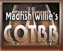
I tried many, many things with that one champagne glass background, and just couldn't make it work. So, I made both cotbb & cotbg logos similar .... Both are 128px wide and 105px high. If they aren't okay, let me know...
I like the water background. :)


You are the best! I like the Corner logos much better than the ones I did... mine look like poop... but I have to say it was my very first attempt at doing any image work.
The HammerHead will look great on sites with really dark backgrounds. I put the transparent one on over at SAPSA and the edges look a little rough. This one will look much better, especially with the maroon border.
Is the water background going to work with a banner style logo? I bet it will look great as a page background!! I can't wait to get started on this site's design... I have lots o' cool ideas!!!
posted by: The Bartender on December 28, 2003 08:51 PMMs Pam: Is there any way to put the transparent logo on the water? I guess what I'm trying to say is the smaller lettering on the transparent logo on the water background logo. Do you like the water background here? I'm a little iffy on it myself.
posted by: The Bartender on December 29, 2003 12:40 AM