January 30, 2004
Homicidal Maniak - Final Design

Above is a screen capture of the final design presented and approved by Homicidal Maniak.
Here is a full screen sample at 1024x768 resolution. This view is the site non IE users will see. The embedded font technology will not show in other browsers. The following view for the 800x600 resolution show the embedded font in the date bar, in the post title, and the sidebar titles.
Here is a full screen sample espceially for viewers 800x600 resolution. This view is implemented via a button at the top of the left column. Clicking the button will give the readers with 800x600 resolution access to a readable site. Both sites update simultaneously through the regular posting method. I also installed modules for the links that will update both site views with one edit. Cool stuff!
Here is an Trackback Template screen sample. I installed the logo graphic and tweaked the CSS for this template. I also installed the logo graphic on all the comment templates.
Here is a roll-down or expanding comment listing screen sample. The shows how the previous comments display when you click the roll-down comment link. I really like this script because I don't like waiting for the comment window to open. A reader friendly feature.
Here is a closed comments in the Monthly or Date-Based Archives screen sample. To prevent the old comments from being spammed, I installed a script that closes access to comment posting after 30 days. Notice that on the January 29 post the comment link is working. The January 30 post has the comments disabled and tells the reader that there are "x" comments to read via the roll-down comment feature.
This site was more of a "complete and tweak" design effort. The site author had the basic layout, color scheme, and graphics completed, but was trying to implement a 3 column design. A regular reader of Eric over at Straight White Guy, she passed a message to me via Eric. So, we got together and implemented a 3 column design plus did some slight tweaking to the stylesheet.
This site required a couple of new design elements that were fun to implement.
Site Features:
More designing thoughts »
- Custom 3 column design
- Custom 800x600 View script, page design and implementation
- Installed archive pages logos
- Installed comment pages logos
- Installed trackback page logo
- Custom archive pages designed
- Custom comment pages designed
- Custom trackback page designed
- Custom display trackback pings code
- Installed text formatting scripts and shortcut buttons for comments
- Installed a comment closing script for all archives
- Expanding & collapsing extended entry scripts
- Expanding & collapsing comments viewer scripts
- Embedded font technology for IE compatible browsers
« No more thinking!
Read comments »
by
Madfish Willie
on
Jan 30, 2004
::
Permalink
::
Comments(0)
::
Design Portfolio
»
party poker links with:
party poker
January 28, 2004
U S U R P - Final Design

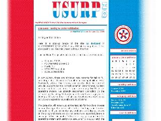
Above is a screen capture of the final design presented and approved by U S U R P [United Society of Unusually Responsible People].
Here is a full screen sample at 1024x768 resolution. It's a large image, so it may take a while to download on a dial-up connection.
Here is a full screen sample at 800x600 resolution. On the 800x600 view, the red is solid all the way to the edge of the page, and the blue fades to white toward the edge of the page.
Here is an Individual Entry Archives screen sample. I placed all the archives in the same format as the main page for a consistant look and access to all the site links from any view.
Here is a comment listing screen sample. I placed the trasparent gif logo on all the comment and trackback templates so the colored background would show through.
Notice that the design is off-center with the red column on the left narrower than the blue column on the right. We matched the color scheme to an existing logo the site administrator had already designed. Then, we tweaked his logo design to make it a transparent gif image to place on the blue background of the comments and trackback listings. The background is a 20px high image with three color columns. We repeated the image down the Y-axis of the body to achieve the gradient fill effect with the colors fading to white. This approach required us to use exact positioning methods to place the content column and the sidebar column.
All in all, this site required several unusual and challenging design aspects that were fun to implement.
Site Features:
More designing thoughts »
- Custom off-center 2 column design
- Custom banner/logo
- Custom background graphic
- Custom archive pages logos
- Custom comment pages logos
- Custom trackback page logo
- Custom archive pages designed
- Custom comment pages designed
- Custom trackback page designed
- Custom display trackback pings code
- Installed text formatting scripts and shortcut buttons for comments
- Expanding & collapsing extended entry scripts
- Expanding & collapsing comments viewer scripts
« No more thinking!
Read comments »
Ordinarily he was insane, but he had lucid moments when he was merely stupid. Heinrich Heine (1797 - 1856)
posted by
money tree payday loan at November 23, 2004 07:03 AM
« Hide comments
by
Madfish Willie
on
Jan 28, 2004
::
Permalink
::
Comments(1)
::
Design Portfolio
January 19, 2004
S A P S A - Final Design
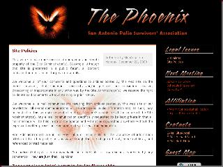
Above is a screen capture of the final design presented and approved by San Antonio Polio Survivors Association.
Here is a full screen sample at 1024x768 resolution.
Here is a 800x600 resolution screen sample.
This is a site I did for my mother. She is an retired RN and a polio survivor. She does a monthly newlewsletter for her local support group, and I thought it would be a good idea for her to put all this stuff on-line.
The graphics on this site are just awesome. Pam took the image my mom liked and turned out some really fantastic logos and backgrounds. Then, she used that same type-style to use as captions for the sidetitles. Phenomenal work!
Site Features:
More designing thoughts »
- Custom 2 column design
- Custom banner/logos
- Custom graphics for post background
- Custom graphics for sidetitles
- Custom graphic for sidebar
- Custom archive pages logos
- Custom comment pages logos
- Custom trackback page logo
- Custom sidebar background images
- Custom archive page designs
- Custom comment page designs
- Custom trackback page design
- Custom display trackback pings code
- Custom Authored By / Date coding
- Expanding & collapsing extended entry scripts
- Expanding & collapsing comments viewer scripts
« No more thinking!
Read comments »
by
Madfish Willie
on
Jan 19, 2004
::
Permalink
::
Comments(0)
::
Design Portfolio
January 15, 2004
She Who Will Be Obeyed - Final Design
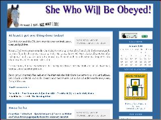
Above is a screen capture of the final design presented and approved by Beth at She Who Will Be Obeyed. Here is a 800x600 full screen sample.
Site Features:
More designing thoughts »
- Custom 2 column design
- Custom static background image
- Custom banner/logo
- Custom archive pages logos
- Custom comment pages logos
- Custom trackback page logo
- Custom sidebar background images
- Custom archive page designs
- Custom comment page designs
- Custom trackback page design
- Custom display trackback pings code
- Expanding & collapsing extended entry scripts
« No more thinking!
Read comments »
by
Madfish Willie
on
Jan 15, 2004
::
Permalink
::
Comments(0)
::
Design Portfolio
January 14, 2004
Consent of the Governed - Final Design
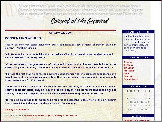
Above is a screen capture of the final design presented and approved by Consent of the Governed site administators. Here is a 800x600 full screen sample.
Site Features:
More designing thoughts »
- Custom 2 column design
- Custom static background image
- Custom banner/logo
- Custom archive pages logos
- Custom comment pages logos
- Custom trackback page logo
- Custom sidebar background images
- Custom archive page designs
- Custom comment page designs
- Custom trackback page design
- Custom display trackback pings code
- Expanding & collapsing extended entry scripts
- Expanding & collapsing comments viewer scripts
- Random quotes script
« No more thinking!
Read comments »
There are two ways to slide easily through life; to believe everything or to doubt everything. Both ways save us from thinking. Alfred Korzybski (1879 - 1950)
posted by
free 3 in 1 credit report at November 21, 2004 10:05 PM
Tuscon plumbing contractor kitchen and bath remodeling california concrete contractor plumbing supplys Washington DC painting contractor roofers tool Seattle kitchen remodeling chicago house painting Orlando kitchen remodeling bathroom remodeling houston Long Island bathroom remodeling roof contractor oklahoma city custom built cabinets kitchen planning remodeling service Chicago maid service plumbing repair part contractor general school Sacramento swimming pool contractor residential building contractor Kansas painting contractor concrete pavers custom log home builder Phoenix maid service NYC kitchen remodeling texas general contractor Naperville painting contractor concrete company arlington general contractor Chicago kitchen remodeling commercial painting contractor San Diego bathroom remodeling Orlando roofing company california pool swimming contractor fireplace chimney cleaning connecticut roofers building remodeling repair contractor houston custom home builder Oregon metal roofing contractor Houston air conditioning contractor kitchen remodeling st petersburg Tallahassee swimming pool contractor Richmond bathroom remodeling kitchen remodeling sarasota contractor general san jose chimney fireplace repair general contractor columbus New England garage door repair basement remodeling Denver concrete contractor san francisco electrician
posted by
Plaut at December 14, 2004 05:12 AM
Get all the fools on your side and you can be elected to anything. Frank Dane
posted by
Los Angeles concrete contractor at December 14, 2004 05:12 AM
Hello folks nice blog youre running
posted by
lolita at January 19, 2005 07:33 PM
Find a roofing contractor in your area to make roof improvements or additions.
posted by
roofing contractor at March 15, 2005 02:16 PM
roofing tile
posted by
roofing tile at March 22, 2005 03:47 PM
special trade contractor
posted by
special trade contractor at March 30, 2005 12:12 PM
interior designer
posted by
interior designer at May 5, 2005 02:55 PM
http://weddingrings.tblog.com diamond wedding rings diamond wedding rings
posted by
wedding rings at August 26, 2005 09:51 PM
web hosting http://www.webhosting-x.com
posted by
web hosting at October 16, 2005 06:36 AM
realtors http://www.realtors-x.com
posted by
realtors at October 16, 2005 08:53 AM
« Hide comments
by
Madfish Willie
on
Jan 14, 2004
::
Permalink
::
Comments(11)
::
Design Portfolio
January 13, 2004
Civilization Calls - Final Design
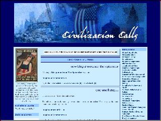
Above is a screen capture of the final design presented and approved by Civilization Calls. Here is a 800x600 full screen sample.
Site Features:
More designing thoughts »
- Custom 3 column design
- Custom banner/logo
- Custom archive pages logos
- Custom comment pages logos
- Custom trackback page logo
- Custom archive page designs
- Custom comment page designs
- Custom trackback page design
- Custom display trackback pings code
- Expanding & collapsing extended entry scripts
- Expanding & collapsing comment viewing scripts
« No more thinking!
Read comments »
by
Madfish Willie
on
Jan 13, 2004
::
Permalink
::
Comments(0)
::
Design Portfolio
January 06, 2004
HammerHead Banners


Read comments »
Beauty! Much better with the smaller text.
Sorry I haven't been paying attention, but I've been busy with some technical difficulties at Madfish Willie's
I'll get started on all the backpages as soon as I debug an update to the standard MT comment preview template. It seems that it doesn't put the remember me options in that template. I've got it installed in a revised template but am trying to work out a margin problem with the data input boxes. It's been beating me up for a while now. Maybe, I'll just let it go and revisit it later tonight.
posted by
The Bartender at January 6, 2004 07:15 PM
« Hide comments
by
Madfish Willie
on
Jan 06, 2004
::
Permalink
::
Comments(1)
::
Banner Portfolio
January 04, 2004
SWG - Part Deaux
HammerHead Blog Designs is proud to announce the birth of a new baby boy!
Eric, the Straight White Guy now has a brand new custom designed look! Go over and check it out and buy Eric a cigar... or a grilling Apron!
Pamibe over at Drowning at 2 Feet Sea Level did all the banners and graphics and buttons for the site [more than once, I might add]. I just can't describe how well she responds to what the site owner wants and comes out with something unique for each individual project. Just a marvelous talent as far as I'm concerned.
Madfish Willie had to pull out the big hammer and do some serious beating about Eric's head and shoulders for extended periods of time. Just kidding... actually it was probably the other way around, although we did run into some unique design challenges to make the site operational for his readers viewing exclusively with 800x600 resolution.
Eric decided it was time for a change and decided he wanted a three column design. So we did the three layout and put it up on his main site. Needless to say, there was much gnashing of teeth and raising of hell! So, we decided to take the site down, put up his old site and direct everyone over the HammerHead design studio at MadLab. Eric did a post directing his readers to come by the site and leave comments on what they were seeing with what browser at what resolution. We left it up there for a couple of days and worked out each problem as it came up.
We finally worked out the main design challenge - which was making the site viewable in 800x600 resolution. A three column design is just not conducive for 800x600 viewing. My inspiration and guidelines for overcoming this issue came from Jim at Snooze Button Dreams. I have a test skin up over there that he points to and accesses via a different index file and associated stylesheet. So, I tore that page out of his book added a script from JaveScript.com and adapted it for Eric's site. As you go to Eric's main page, you will notice a button labeled [View Old Format] in the left sidebar. When you click that button, it takes you to his old two column layout. We formatted the site using the new stylesheet and adapted the three column index to the two column layout. We were both real pleased at the outcome and the flexibility it gives him in presenting his site.
One of the features of this method is that when he posts to his main site, both sites are updated when the index is rebuilt! Cool beans! I also used some modular techniques in order to update the links in both indexes with just one edit.
We did most of the debugging and troubleshooting via MS Messenger so I could respond immediately to his change requests. At each edit we would either approve the change and move forward or go back and start over. It was a very effective way get things done for both of us.
Here is a list of some of the other features we designed for Eric:
More designing thoughts »
- Custom 3 column design
- Custom 2 column design
- Custom banners & logos
- Custom graphics in sidebars
- Custom archive pages logos
- Custom comment pages logos
- Custom trackback page logo
- Custom sidebar background images
- Custom body background image
- Custom blog background image
- Custom archive page designs
- Custom comment page designs
- Custom trackback page design
- Custom display trackback pings code
- Expanding & collapsing extended entry scripts
- Expanding & collapsing comments viewer scripts
- Text formatting buttons in comment listing and comment preview templates
- Coding based on heavy use of modular programming techniques
- Access to a secondary site updating with primary site data for 800x600 viewers
« No more thinking!
Read comments »
Great people talk about ideas, average people talk about things, and small people talk about wine. Fran Lebowitz (1950 - )
posted by
bad credit card offer at November 22, 2004 11:14 AM
You may find it interesting to check the sites in the field of casino .
posted by
gambling at September 29, 2005 06:44 PM
Flooring is known as flooring. floor covering is called Flooring. Wood Flooring is furnished by wood.you want very attractive floor use Bamboo Flooring.Concrete Flooring means floor furnished by premium acid stain.Cork Flooring by earth friendly material.Flooring Industry With a variety of colors, shapes, sizes, and textures. Garage Flooring is furnished by mat from better life technology.If you want to floor like wood use Hardwood Flooring.Laminate provides exciting spark for your creativity Laminate Flooring. Marble Flooring is furnished by different types of marble.Pergo Flooring manufactures laminate flooring.Rubber Flooring installing and maintaining by rubber tiles. Stone Flooring is a Wide range of natural stone flooring from global sources in slate, granite, marble, limestone and sandstone.Tile Flooring provides a wide range of flooring including carpets and cushion.Vinyl Flooring contains sheet, tiles and floor benefits.Flooring Requirements depends on flooring traffic.Linoleum Flooring is a highly durable sheet and tile flooring.Laminated Flooring Quality depends on lamination of floor.
posted by
Flooring at October 18, 2005 04:05 PM
« Hide comments
by
Madfish Willie
on
Jan 04, 2004
::
Permalink
::
Comments(3)
::
Announcement
January 01, 2004
HammerHead Designs
Ms Pam: I was thinking that I need to maybe limit the number of small graphics per site in the middle sidebar. Maybe I could get a 150px wide pamibe dog and anything else you have available. I'll probably switch out the SAPSA images for maybe one plus the phoenix logo thingy. What I'm trying to do is keep the center column at least as long as the far right column to keep a "balanced" look. If you have any other images you'd like to highlight and display here let me know where to grab them.
Also, you will notice several posts pointing to the HTML pages of logos you have done for some of the sites we have worked on together. Could you edit the SAPSA page so that the sidetitles are not there and the text is off? Thanks a whole lot.! If you could upload those pages to HammerHead, it will take the bandwidth back to where it should be. Just let me know when and what the path is and I'll edit the posts.
Any design credit logos will point back to HammerHead so that bandwidth will come off this site also.
I'll start working on the backpages for this site on Saturday. Tomorrow I need to finished Linda's site Civilization Calls. I'll be on-line after noonish, so holler if you need anything.
Read comments »
It is dangerous to be sincere unless you are also stupid. George Bernard Shaw (1856 - 1950), Man and Superman (1903) "Maxims for Revolutionists"
posted by
georgia payday loan at November 22, 2004 03:39 AM
« Hide comments
by
Madfish Willie
on
Jan 01, 2004
::
Permalink
::
Comments(1)
::
Design Thoughts
MFW - New Years Eve
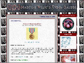
Above is a screen capture of the last design for Madfish Willie's Cyber Saloon. I kept messing around and tweaking this site from the get go, so this is about the 8th or 9th design I have displayed on this site. This particualr background is for New Year's Eve. I change the background wallpaper out all the time to keep the site fresh for both of my regular readers. How about that baby picture?
Here is a 800x600 full screen sample. It may take some time to load... be patient!
Site Features:
More designing thoughts »
- Custom 2 column design
- Custom banners & logos
- Custom graphics in sidebars
- Custom archive pages logos
- Custom comment pages logos
- Custom trackback page logo
- Custom sidebar background images
- Custom body background image
- Custom blog background image
- Custom archive page designs
- Custom comment page designs
- Custom trackback page design
- Custom display trackback pings code
- Expanding & collapsing extended entry scripts
- Expanding & collapsing comments viewer scripts
- Rotating banners script
- Random quotes script
- Coding based on heavy use of modular programming techniques
« No more thinking!
Read comments »
by
Madfish Willie
on
Jan 01, 2004
::
Permalink
::
Comments(1)
::
Design Portfolio
SWG - Final Design
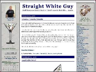
Above is a screen capture of the final design presented and approved by Straight White Guy. Here is a 800x600 full screen sample.
Site Features:
More designing thoughts »
- Custom 3 column design
- Custom banner/logo
- Custom graphics in sidebars
- Custom archive pages logos
- Custom comment pages logos
- Custom trackback page logo
- Custom sidebar background images
- Custom archive page designs
- Custom comment page designs
- Custom trackback page design
- Custom display trackback pings code
- Expanding & collapsing extended entry scripts
- Expanding & collapsing comments viewer scripts
« No more thinking!
Read comments »
by
Madfish Willie
on
Jan 01, 2004
::
Permalink
::
Comments(0)
::
Design Portfolio
»
Madfish Willie's Cyber Saloon links with:
HammerHead Blog Design
SWWBO - Banners


Here are some more banners created by pamibe Graphics for She Who Will Be Obeyed.
This page contains several banner images and will take some time to load... please be patient and see the fine work done by pamibe.
Read comments »
by
Madfish Willie
on
Jan 01, 2004
::
Permalink
::
Comments(0)
::
Banner Portfolio
SAPSA - Banners

Here are some
more banners created by
pamibe Graphics for
San Antonio Polio Survivors Association [S A P S A].
This page contains several banner images and will take some time to load... please be patient and see the fine and creative work by pamibe.
Read comments »
by
Madfish Willie
on
Jan 01, 2004
::
Permalink
::
Comments(1)
::
Banner Portfolio
MFW - Banners

Here are some
more banners created by
pamibe Graphics for
Madfish Willie's Cyber Saloon.
Madfish Willie used these banners to create a rotating banner at the top of his page. Every time you reload the page, a different banner is displayed. Check it out!
This page contains several banner images and may take some time to load... please be patient and see the fine and creative work by pamibe.
Read comments »
by
Madfish Willie
on
Jan 01, 2004
::
Permalink
::
Comments(0)
::
Banner Portfolio
SAPSA - Side Titles
Here is a side title created by pamibe for the San Antonio Polio Survivors Association. Check the extended entry for a complete sample display.

More designing thoughts »
Read comments »
by
Madfish Willie
on
Jan 01, 2004
::
Permalink
::
Comments(0)
::
Sidetitles Portfolio
SWG - Glass - Fading Stem

Read comments »
by
Madfish Willie
on
Jan 01, 2004
::
Permalink
::
Comments(0)
::
Graphics Portfolio
SWG - USMC Logos


Read comments »
by
Madfish Willie
on
Jan 01, 2004
::
Permalink
::
Comments(0)
::
Graphics Portfolio
SWG - Glass - Background

Read comments »
by
Madfish Willie
on
Jan 01, 2004
::
Permalink
::
Comments(0)
::
Graphics Portfolio
SWG - Glass - Color

Read comments »
by
Madfish Willie
on
Jan 01, 2004
::
Permalink
::
Comments(0)
::
Graphics Portfolio
SWG - Glass - Side B&W
Read comments »
by
Madfish Willie
on
Jan 01, 2004
::
Permalink
::
Comments(0)
::
Graphics Portfolio
SWG - Glass - Side Color
Read comments »
by
Madfish Willie
on
Jan 01, 2004
::
Permalink
::
Comments(1)
::
Graphics Portfolio
Madfish Willie's Gangs


Read comments »
by
Madfish Willie
on
Jan 01, 2004
::
Permalink
::
Comments(0)
::
Graphics Portfolio
HammerHead Buttons


Read comments »
by
Madfish Willie
on
Jan 01, 2004
::
Permalink
::
Comments(0)
::
Graphics Portfolio
HammerHead Logo
I have some ideas for HammerHead logo/banner thingys [yes, thingys is indeed a certified technical term in the blogosphere] and such.
First, I would like to do a rotating banner like we did at Madfish Willie's Cyber Saloon. I have the script installed to run it as soon as we can come up with something.
My ideas naturally include that cool hammerhead shark in the posts. How about an image like the transparent gif at the top of the graphics column. Have that stretch across the body post and above the other two columns put in a scripty type font "blog designs for [top line] hammerheads [bottom line]. I like the color scheme and outline of the type in the current image. Could you add "Designs" under the HammerHead on the banner shark?
Another idea would be to have just the shark on one side and on the other HammerHead Designs [top line] blog designs for hammerheads [bottom line]
Maybe switch sides for another banner. If we do one with a colored background, it should stretch across the entire width of the columns?... and have a maroon or teal border?... maybe a whole school of sharks in different sizes and make it look like the smaller they are, the further away they are by making them lighter... [grabbing another bottle of champagne] Happy New Year!... wow, can you make them move around? That would be really neat - as long is it doesn't slow the page load too much.
I guess that we just need one up pretty soon just so we have something other than that ugly standard poop from MT.
Anyway... those were just some thoughts and ideas... that part of it is your gig and I'm sure that you'll come up with something really cool for us.
Thanks!
More designing thoughts »
I'm going to grab a couple of the Straight White Guy images and post them in the Graphics sidebar. And maybe do a separate HTML page for banners and link over to it from here. Use the same background as this page or the page they are on? Maybe do a page of grahics from each site? What do you think would be the best way to go about that? Are there any other images you want and can display?
I'm off to other things right now, so I'll check back over tomorrow!
Merry New Year!!!!
« No more thinking!
Read comments »
I'll work on those either later today or tomorrow. My head kinda hurts. Probably from all that smoke outside last night...
I did download MS messenger yesterday, and have it open now most of the time. It's my email addy... pamibe@ well, you know the rest. :)
Happy 2004!
posted by
pam at January 1, 2004 08:16 AM
No problem... take your time, I'm not in a big hurry or anything...
Happy 2004 to you and your family!!
posted by
The Bartender at January 1, 2004 01:14 PM
« Hide comments
by
Madfish Willie
on
Jan 01, 2004
::
Permalink
::
Comments(2)
::
Graphics Thoughts


