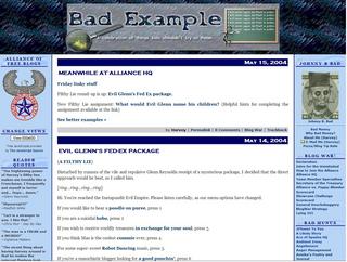

Above is a screen capture of the final design presented and approved by Bad Example.
This is a site I did for my buddy Harvey. It's all his fault I got into this blogging thingy... his, and Matty O'Blackfive.
His old site at Bad Money was a slow loading dog. I used to open a second IE window just for his site and browse around in the other window till his got loaded. His site had been acting funky for several weeks so, after several months of not so gentle poking and prodding, we finally convinced him to move over to MuNuviana and an MT blogging system.
The graphics on this site are just awesome. Pam took the mental image Harvey gave her, improved on them and turned out some really fantastic logos and backgrounds. Page load speed was an essential element of his design and we took that into account in optimizing the size of his banner images. Outstanding work! I'll put all her Bad Example banners in another post so you can see them all.
Site Features: