Hammerhead Design Portfolio
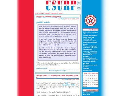
The final design presented and approved by U S U R P [United Society of Unusually Responsible People].
Notice that the design is off-center with the red column on the left narrower than the blue column on the right. We matched the color scheme to an existing logo the site administrator had already designed. Then, we tweaked his logo design to make it a transparent gif image to place on the blue background of the comments and trackback listings. The background is a 20px high image with three color columns. We repeated the image down the Y-axis of the body to achieve the gradient fill effect with the colors fading to white. This approach required us to use exact positioning methods to place the content column and the sidebar column.

