Bad Example
Civilization Calls
Consent of the Governed
Pamibe
Frinklin Speaks
HammerHead Designs
homicidalManiak
Madfish Willies | Grey
S A P S A
She Who Will Be Obeyed
SBD | Skin
Straight White Guy
U S U R P

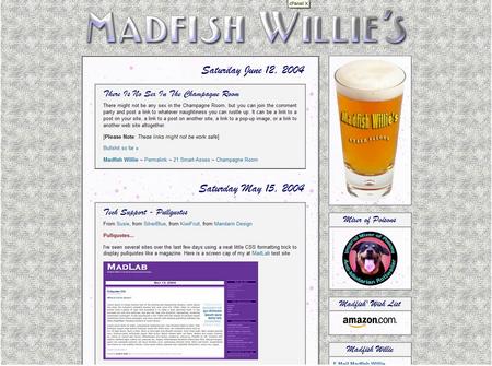
This Madfish Willie's Grey is the 11th or 12th iteration of my site.
Originally, I designed my site with a teal background and maroon borders, accent colors, and reversed text to separate posts and sidetitles. After a couple of monthe I frew tired of that, and I switched to a more more approach using background images all over the place. Getting tired of that I wanted to go in a totally different direction.
I was in the middle of a total re-design, and started playing around with some background images I found. After trying several that I liked and not being able to the best one, I decided to design a nuetral colored site that would let me take the best background images and change them out weekly. This approach let's me change the look and feel of the site easily enough to keep it fresh but not looking like a totally different site each week.
After I decided on some base colors, Pam came up with some nifty new banners images for me. They incorporate my basic color scheme to both compliment and contrast the background images. I put them all into a rotating banner script to display a different banner each time the page is loaded or refreshed. If you go to my site, hit [F5] or [refresh] to cycle through the selections.