Portfolios
Services
HammerHead Design Portfolio
Argghhh!!!
Bad Example
Civilization Calls
Consent of the Governed
Pamibe
Frinklin Speaks
HammerHead Designs
homicidalManiak
Madfish Willies | Grey
S A P S A
She Who Will Be Obeyed
SBD | Skin
Straight White Guy
U S U R P
Bad Example
Civilization Calls
Consent of the Governed
Pamibe
Frinklin Speaks
HammerHead Designs
homicidalManiak
Madfish Willies | Grey
S A P S A
She Who Will Be Obeyed
SBD | Skin
Straight White Guy
U S U R P
Contact Info

Hammerhead Design Portfolio
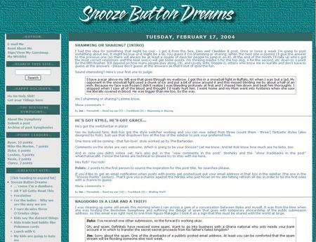
This is an unused design for Snooze Button Dreams. D'oh! It was one of my earliest efforts using CSS. I was still searching for my particular designing style.
Client said he wanted to stay with a green color scheme, so here it is. The background color overpowers the entire page. Then the line-height spacing was adjusted down. The text baselines are too close together, making it difficult to read. An interesting learning experience for Madfish Willie!